


C&J Blog Article
Mood boards - today\'s topic!
So: you’ve got a problem room, you’ve chosen your paint colour and are therefore - or so you think - ready to decorate. Well think again. Before so much as reaching for the roller or brandishing a single brush, there are issues to consider and if you don’t indulge your dream scheme with a little forethought, the likelihood is you’ll live to regret it in some way, at least. Being well informed, after all, is paramount and there are things you can do, while planning, to make your project run as smoothly as it possibly can. Cue the mood board. That oft’ overlooked, regularly misunderstood and sometimes maligned tool will help you on the road to design salvation. In layman’s terms, the mood board is a crucial mechanic with which to ease uncertainty; a device that proffers vital assurance, before committing to expense and upheaval. To fail to plan, after all, is to plan to fail but if you follow our logic, every project you tackle will roll out successfully.
So do we practise what we preach? Absolutely. Along with the thousand or so rooms we’ve redesigned thus far, we’ve created a thousand or so thematically appropriate mood boards. Historically, some of our staff have viewed the mood board as an unnecessary obstacle to hinder timely completion of projects, but the erstwhile tool is, as far as we’re concerned, an important stage if our visions are to be carried out correctly. As a starting point to any design, mood boards are indispensable.
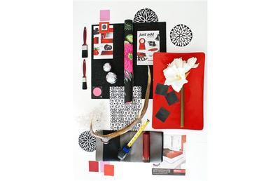
The mood board we’ve used to illustrate today’s opus is from a U.K. project on which we’re working. As part of a scheme to re-identify several rooms in the home of a London banker, we’re also reworking a semi-derelict integral garage to the side of our client‘s house. Felix, the 17-year-old son of our paymaster, expressly asked for a casual domain at odds with his father’s more retrained instruction. Essentially, a secondary lounge/bedroom where Felix can chill with his peers, we’re creating a loft living mood with a white painted backdrop and red accents. To soften the contemporary feel, we’re incorporating an antler chandelier, grey rugs on a poured rubber floor and monochrome accent wallpaper. The scheme will be pulled together with ruby ceramics and glasswares, a trio of red leather bean bags and an outsized platform bed.
The mood board concept
A mood board, put simply, is a visual realization of ideas. By combining proposed paint colours, wallpaper scraps, fabric swatches and flooring — alongside pictures of furniture and accessories — you’ll find it easier to stage your work due to the fact you’ll be able to see elements of everything at one time. With schematic samples carefully collected, you can assess colour combos and then adjust everything until it all comes together. It’s sensible to start off with a key piece around which you hope to build the room; that anchor could be a wallpaper sample, an image of a credenza or perhaps a favourite rug. If you’ve spotted an appealing vignette in a magazine, simply tear out the page. It may be that what you think will work will look less than comfortable when combined with other aspects of your mood board.
Building a mood board
Kick everything off with a section of strong cardboard or a piece of painted MDF; choose a colour that reflects the majority backdrop of your room. A3 size is perfect, but feel free to scale up — or down — to suit your own needs. Tester paint pots are useful, but to avoid their associated costs, obtain colour chips and sync these with material, wallpaper and flooring. Some fabric outlets will charge you for sample cuts, but these costs are generally deducted from subsequent purchases. If you’re working around an existing furniture piece, photograph it and position the image on your board. If you’re starting from scratch, download images of items you like from the Internet or clip pictures from magazines and brochures.
Think proportion
It’s useful to scale each sample according to how it will appear in your room. If painting all four walls, for example, colour the entire board in a uniform tone. If wallpapering, endeavour to add the relevant proportion of paper even if that means almost entirely covering your board. Tip: leave a white painted band around the perimeter edge to represent window frames and ceiling if your mood board is crafted upon a wallpaper base. When laying on fabric, ensure it’s scaled to represent the quantity that will appear in your design. Follow the same principle for soft furnishings such as upholstery, toss pillows and throws.
Playing with the pieces
Assemble your mood board in the room it references; it’s useful to look at the way in which component parts react to both natural and electric light. Some designers like to assemble their mood boards to reflect where each aspect will appear in the project room and, as such, will position flooring samples at the bottom, upholstery and curtaining in the middle and paint or wallpaper colours around and above. While this route is certainly viable, we find it easier to arrange layers and then play around with them to ascertain what works and what doesn’t in terms of colour, mood and contrast. When arranging pieces, avoid attaching them with glue as this will limit flexibility and forgo the flexibility that comes with being able to move things around; we find pins, tape or Blu Tack much more appropriate. Tip: photograph your mood board as you build it and carry images during subsequent sourcing trips; doing this will allow you to remember what goes where if you have to disassemble anything and take it with you.
Sort out combinations
With all samples at hand, now is the time to be ruthless. If combinations don’t work, then it’s a surefire indicator they’ll look like uncomfortable when realized as part of your room. And, of course, we don’t need to explain the logic of changing your mind at mood board stage to avoid costly regrets when you’ve bought and installed your kit. If you’re not “feeling it,” hit the stores for further samples and jump back on line to find pieces that will comfortably replace those that didn’t quite marry. The most successful plans are those that evolve after careful consideration and the loveliest surprises are those which are birthed from unexpected, even accidental pairings.
Further reading, The Home Decorators Colour and Texture Bible by Adrienne Chinn (published by Firefly Books) $18.87 at www.amazon.ca. This lovely book is crammed with colour combinations and workable palettes, all of which will help keep you on the decorative straight and narrow.